

Colour selection
Pick the surface then pick the colour.
Stamped patterns and integral pigment belong to new flat work, while flake blends and clear topcoats belong to floors we coat over. Start from the surface and the palette narrows itself.
Where to start
The surface decides
the palette.
Every colour question on this site splits along one line: are we placing new concrete, or treating concrete you already have? New flat work takes its colour in the mix and at the surface while the slab is still plastic, so you settle pattern and pigment before the truck ever backs up. A coating carries its colour in what we broadcast into the resin and lock under the topcoat, and that choice can wait until the job is nearly on the calendar.
That difference in timing matters more than taste does. Integral pigment runs right through the slab, so a chip years later shows the same colour it showed on day one. A release agent adds the secondary tone that stops a stamped pattern reading flat. Flake works the other way round: the chips sit in a resin body under a clear coat, protected instead of exposed, and a busy blend hides tyre marks and dust far better than a solid tone ever will.
Grey concrete isn't one grey, either. Cement source, water content, how fast a slab cures and what the weather did that week all move the finished tone, so two pours from the same plant a month apart can land visibly apart. Treat colour on flat work as a family decision. Pick a tone that suits the house and let the slab keep its own opinion inside a shade or two.
 01
Flat Work
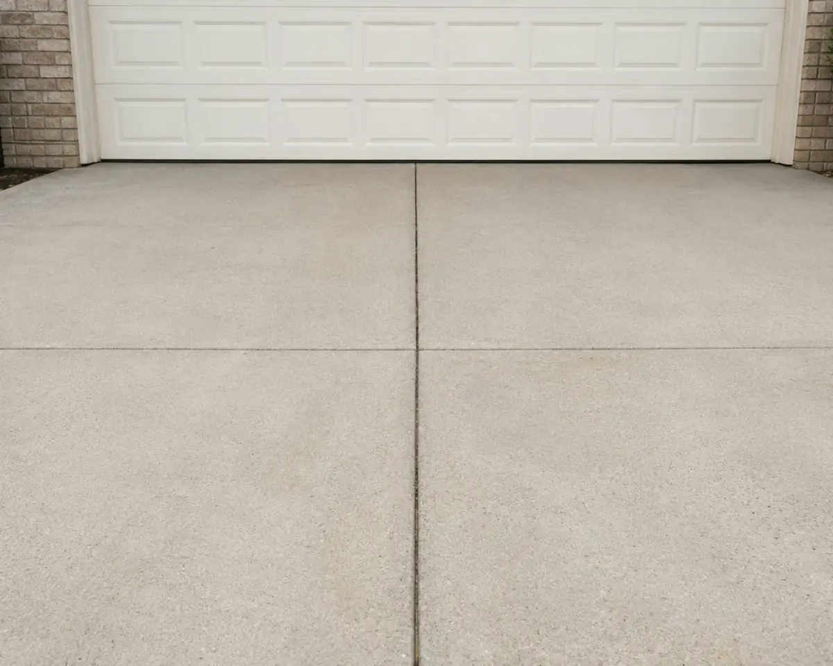
Stamped patterns in brick and cobblestone, flagstone and slate, wood plank and ashlar, with integral colours and release tones: Sandstone, Buff, Autumn Brown, Weathered Gray, Terra Cotta and Charcoal. Patterns and colours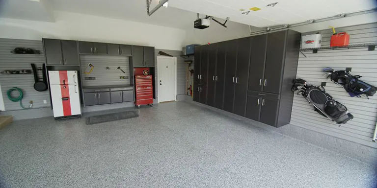 02
Coatings
Eighteen flake blends photographed from our own sample boards, for garage, gym, warehouse and retail floors. If none of the eighteen is right, we can put together a custom colour of your own. See the flake gridOver the years
Colour keeps moving
after we leave.
Pigment isn't permanent. Sun, salt, sealer and traffic all pull a finished surface off the sample board, and the direction of travel isn't the same for a stamped patio as it is for a garage floor.
The first season
A new slab pushes salts to the surface as it dries, and a white haze can show up within the first few months. That's efflorescence. It isn't a defect and it doesn't last: it washes and wears away, and the colour underneath settles once the slab finishes drying out.
Sealer sets the depth
Sealer shifts colour further than most people expect. A wet-look acrylic can take a stamped patio a full shade darker and pull the release tone forward (it's roughly the effect you see when rain hits a dry patio), while a matte penetrating sealer leaves the surface reading close to dry concrete. Ask to see both over the same sample.
Sun does the rest
Ultraviolet light at altitude fades warm pigments faster than cool ones, so reds, terra cottas and deep browns drift first while buff, sandstone and grey hold their ground. On a coating the topcoat chemistry counts for as much as the pigment does. A clear aromatic film ambers over a sunny bay. An aliphatic polyaspartic stays clear.
Traffic writes on it
Wear shows up differently on each system. A polished floor burnishes brighter along the walking lanes, a coating dulls in exactly those lanes instead, and exterior flat work loses its surface paste first at the apron, where the plough blade and the snow shovel land.
| Criterion | New flat work | Coatings |
|---|---|---|
| When you choose | Before the pour, along with the mix design | Any time before coating day |
| How it goes on | Pigment in the mix, dry-shake hardener, antique release powder | Flake broadcast into wet resin, locked under a clear topcoat |
| Depth of colour | Right through the slab, or the top eighth of an inch | The thickness of the resin build |
| What softens the look | Release tone caught in the stamp texture | A blend of chip sizes and colours |
| Sheen | The sealer sets it, matte through wet-look | The topcoat sets it, satin through high gloss |
| Repairs | Patches rarely match; joints hide the change best | Recoat a whole bay so the sheen stays even |
| Fade risk | Highest on warm pigments in full sun | Low under a UV-stable topcoat |
Photograph the samples you like at the property, at the hour you use the space most. A phone flattens colour, but it records relationships between colours honestly enough to settle an argument a week later.
Before you commit
Screens lie about colour.
A pigment photographed for a web page has little in common with the same pigment cured under Colorado sun at altitude. Grey concrete swings warm or cool with the hour and the weather. Gloss reads darker than matte at identical pigment loading, and a flake blend that looks noisy on a two inch chip calms right down across a whole garage floor.
Light source moves it again. Two colours that match under warm showroom LEDs can separate in daylight, and a garage with one door and no windows sits in a far colder light than the patio ten feet outside it.
So we work from physical samples. We offer one-on-one consultation for layout and colour selection, or we hand you the details and let you decide at your leisure.
- View samples outdoors in daylight, held against the property
- Check the tone next to existing brick, stone, siding and trim
- Ask for the largest sample available, not a single chip
- Expect sealed and polished surfaces to read darker than dry ones
- Wet a flat work sample to preview roughly what a wet-look sealer does
- Lay the sample flat on the ground, not upright at eye level
Every colour on this site is a photograph, and it travels through a camera and your screen before it reaches you. Book a consultation and look through the full pattern and colour catalogue in person before anybody orders anything.
Match it closely,
or not at all.
The near miss is what goes wrong. A driveway that lands one shade off the brick reads as an error, while the same driveway three shades away reads as a decision somebody made on purpose. Push your colour to one side of that line or the other.
Work from the things you can't change. Roof, brick, stone and window trim all stay put, and the concrete is the one piece with a choice attached to it. Carry a sample up against each of them at the property, in daylight, and put it flat on the ground where the finished surface will really sit. Colour held upright at eye level lies to you, because it catches the sky instead of the sun.
Indoors, run the same test against cabinet doors, thresholds and whatever flooring the new surface meets at the edge of the room. A flake blend picked to match a cabinet colour usually disappoints, because the floor covers far more of the room and ends up leading it. Pick the blend that supports what's already there.
And take the neighbours into account on exterior work, at least loosely. Terra cotta on a street of grey aprons is a strong statement, which is fine when you mean it.
Four questions worth asking before anything gets ordered: which pigment or flake blend is it, by name; what sealer or topcoat goes over it, and at what sheen; how does the colour get repaired if the slab cracks or a coating chips; and what does the same colour look like after a season of sun? You can see the finish families photographed side by side in the surface gallery .

Next step
Tell us the space, not the colour.
Give us the surface, how it gets used and what it sits next to. We'll cut the palette down to the options that suit it and show you the samples in person.